The multicolored Windows flag is no more. Windows 8 will do away with the wavy Windows logo that Microsoft has used in one form or another for the last 20 years, and replace it with a logo that's, well, a window.
Windows 8 ushers in a new, and completely different, Windows look and feel: it brings the Metro design concept to the desktop. With Metro's emphasis on clean lines and typography, Microsoft wanted a logo that reflected these ideals, and so commissioned agency Pentagram to create the new logo.
Though Microsoft is showing off the logo in blue, in Windows 8 it will change color to match the user's preference.


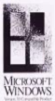
The new logo harks back to the very earliest Windows logos: the simple stylized Windows 1 logo, which represented on-screen windows rather than things with panes of glass, and the old "Windows compatible" black and white hole-in-the-wall window.
The Windows logo has been a flag since 1992's Windows 3.1. The waves of the flag give a sense of motion, apparently, but didn't make a whole lot of sense. In the words of Pentagram's Paula Scher, "Your name is Windows. Why are you a flag?"
Of course, in a few years time, when Metro has become familiar and the desktop gets phased out, a similar question will be asked of the entire Windows name. You see, Metro doesn't have windows at all.
Listing image by Image courtesy of Microsoft
reader comments
322