Apple's latest update to Mac OS X includes a variety of visual changes—some functional, some purely decorative. While you can debate the utility of "skeuomorphic interfaces" while reading our lengthy and in-depth review of Lion, we thought we'd post a more visual tour of Lion.
Dig in and take a look while you wait for Lion's 3.5GB download from the Mac App Store.
First impressions
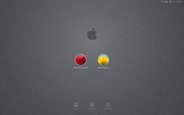
On first boot, Lion shows you a brand new login screen, draped in the linen texture seen as a background in iOS. Each user is represented by a small circular icon, with small monochromatic icons for "sleep," "restart," or "shut down" along the bottom. Along the top are some of the icons and info you'd expect to see on your menu bar once you log in, including battery level, WiFi connection, and date and time. This look is the first clue that Apple is bringing ideas over from iOS to Mac OS X.
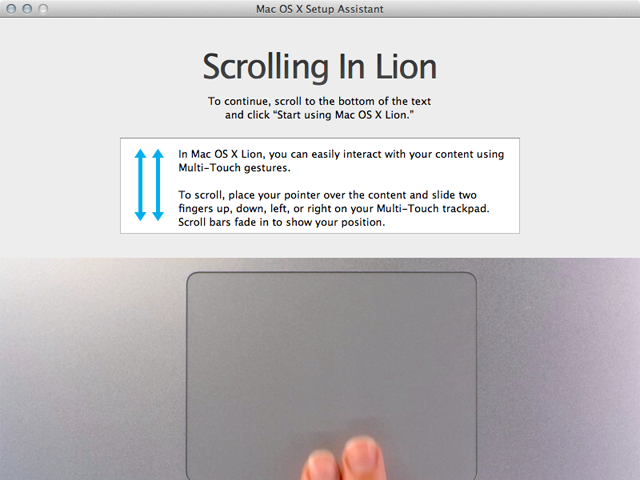
Once you log in for the first time, Lion will also point out its new scrolling behavior, which is the opposite of what we have become accustomed to using trackpads. Scrolling now moves as if you stuck your finger right on the content and moved it up and down—just like you're actually using a touchscreen. It's jarring, and this screen is the first acknowledgment that many users won't be quite ready for it. After a couple days of use, it becomes second nature, but if you switch between Lion and Snow Leopard, it can take some mental gymnastics to compensate.
Finally, be prepared to do a little Dock pruning. Installing Lion adds icons for Mission Control, LaunchPad, FaceTime, in addition to Dashboard, Time Machine, and the Mac App Store. The extra icons make my particular Dock setup—always visible on the left hand side of my MacBook Air with magnification turned off—almost impossible to parse at a glance because the icons are too small.
Finder
Right away you may notice many of the subtle changes in the overall Lion UI compared to Snow Leopard. Window controls for closing, minimizing, and maximizing are smaller and spaced a bit farther apart. Scroll bars are hidden and only appear when scrolling (unless you tweak the default settings in System Preferences). And window resizing kicks in when you move the cursor near any window corner or edge. When the cursor changes, just click and drag.
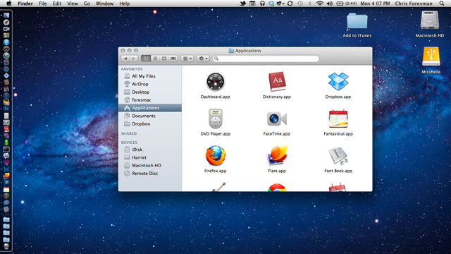
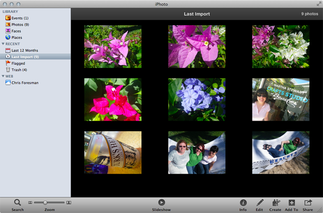
Lion continues the trend of monochromatic sidebar icons, extending from iTunes to the Finder. You will see more of these in Mail and other apps, though strangely not in iPhoto '11 (see below).
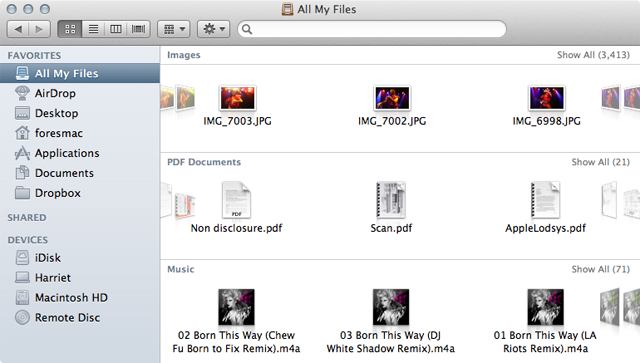
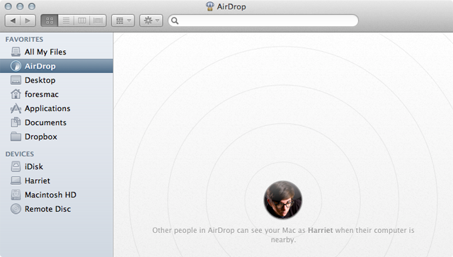
Lion introduces a new Finder view, accessed from the sidebar, called "All My Files." This view gives you mini-CoverFlow views of all of your files divided into categories like images, PDFs, music, documents, spreadsheets, and more. And the new AirDrop feature—which makes it easy to transfer files to users on the same network—is accessed from the Finder sidebar as well.
New look, same as the old look
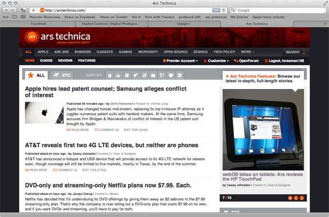
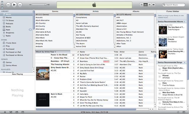
Many things aren't that different. Lion is more of a refinement to Snow Leopard's overall UI theme than a radical departure. Take a look at iTunes, iPhoto '11, and Safari—these apps look largely the same as they did in Snow Leopard. It's worth noting that while Safari and iPhoto (among other apps) have one, iTunes doesn't have a fullscreen mode—at least, not yet.
Just for fun, we launched Office 2011, and everything worked just as it did under Snow Leopard. As a general rule, if it runs under Snow Leopard and isn't old PowerPC code, it'll run under Lion just fine. (Those who rely on Rosetta, however, should stick with Snow Leopard until replacements for critical legacy apps are available.)
reader comments
33