:format(webp)/cdn.vox-cdn.com/uploads/chorus_asset/file/12800775/beck_image.1419979424.png)
© Ken Garland, courtesy of London Transport Museum
You won't find Harry Beck's face on any coins or postage stamps, but his fingerprints are all over London. Born in 1902, Beck was an English engineering draftsman who sparked a small revolution in the early 1930s when he created a radical new map of the London Underground.
His linear, color-coded diagram was at first greeted with apprehension from transit authorities, but soon proved popular among London commuters. Today, it's arguably the most recognizable and influential transit map in the world, having spawned similar designs in major cities across the globe.
The man behind it has remained comparatively obscure, though Beck's legacy garnered new attention this week, when the city of London paid him posthumous homage with an English Heritage Blue Plaque — a prestigious honor celebrating the 80th anniversary of a map that, quite literally, changed the way people move.
:format(webp)/cdn.vox-cdn.com/uploads/chorus_asset/file/2720288/01.1364558642.jpg)
:format(webp)/cdn.vox-cdn.com/uploads/chorus_asset/file/2720292/02.1364559527.jpg)
:format(webp)/cdn.vox-cdn.com/uploads/chorus_asset/file/2720278/03.1364558584.jpg)
:format(webp)/cdn.vox-cdn.com/uploads/chorus_asset/file/2720284/04.1364558614.jpg)
:format(webp)/cdn.vox-cdn.com/uploads/chorus_asset/file/2720294/Sydney_map__1939.1364559875.jpg)
:format(webp)/cdn.vox-cdn.com/uploads/chorus_asset/file/2720290/05.1364558654.jpg)
:format(webp)/cdn.vox-cdn.com/uploads/chorus_asset/file/2720280/06.1364558612.jpg)
:format(webp)/cdn.vox-cdn.com/uploads/chorus_asset/file/2720282/07.1364558613.jpg)
:format(webp)/cdn.vox-cdn.com/uploads/chorus_asset/file/2720286/08.1364558639.jpg)
:format(webp)/cdn.vox-cdn.com/uploads/chorus_asset/file/2720296/beck_image.1364559891.jpg)
1/10
"Beck's map was revolutionary in its simplicity," Sam Mullins, director of the London Transport Museum, said at Monday's unveiling ceremony, which coincided with the Underground's ongoing 150th anniversary celebration. "It has become a London icon and influenced the design of many metro maps across the globe, as well as being the inspiration for many contemporary artists and designers."
Prior to Beck's design, the Underground map was about as legible as a bowl of spaghetti
Prior to Beck's design, the Underground map was about as legible as a bowl of spaghetti. It wasn't until 1908, in fact, that all the Underground lines were displayed on the same map; prior to that, each line had its own pamphlet. Combining the routes into one display was intended to tout the system's breadth and convenience, though the Underground's rapid expansion had unforeseen consequences.
"Some commentary at the time suggested that the map was becoming too complex, because the number of lines was increasing," says Anna Renton, senior curator at the London Transport Museum. "And as the Underground lines were developing and expanding, that map was becoming more crowded, especially in the pocket version."
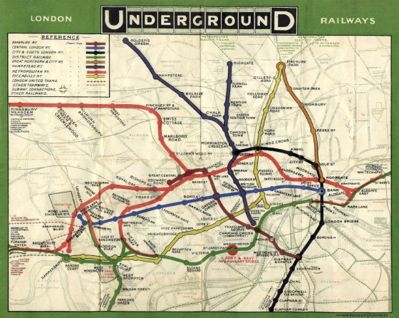
London Underground map, 1908 © London Transport Museum
In the 1908 version, every station was spaced to geographic scale, resulting in a cluster of dots around central London, with just a sprinkling near the city’s outskirts. Interchanges weren't clearly rendered, and every tube line was represented with a curve showing its true path, with above-ground streets and intersections imposed on top. For a bird with x-ray vision, it would have been a remarkably faithful representation. For commuters, it could be downright confusing.
That would change in 1931, when Beck began work on his prototype design. It's not clear what inspired him to undertake the project; according to Renton, he wasn't explicitly commissioned, but likely developed his design in his free time, while between jobs.
"It was more a demonstration of his ingenuity, in seeing a problem and coming up with a solution to it, rather than a response to public demand," she says. By then, Beck had already spent six years working as an engineering draftsman for the London Underground Signals Office — an experience that may have influenced the clean, mechanical aesthetic of his map.
Legibility versus geography
Beck began by replacing the map's existing sinuous curves with straight lines — horizontals, verticals, and 45-degree angles. He also skewed its scale, placing the stations at equal distances from one another, and removed the above ground street grid. The result was a sparse, circuit board-like design that eschewed geographic accuracy for legibility.
Ken Garland, an English graphic designer and Beck biographer, says the map's most innovative feature was its "convex lens" that disproportionately enlarged the area around central London. In an e-mail interview with The Verge, Garland said this approach "was absolutely appropriate" given the high density of tube stations within the region, and that it offered a more elegant way for commuters to make sense of their fast-growing urban jungle.
This enlargement carried a more subliminal connotation, as well, insofar as it made London's outskirts seem close to the city’s commercial hub. "The suburbs were basically created by the expansion of the underground," Renton says. "By making them look closer to the center, and showing how easy it was to commute to the city, the map could have encouraged more people to move there."

Harry Beck's diagrammatic design, 1933 © London Transport Museum
Underground authorities weren't quite sold on the idea. Publicity officials initially scoffed at Beck’s proposal, fearing that the map would be too radical a departure, but eventually agreed to print it in pocket form in January 1933. It was published in poster format by March of that year, and before long, became the new standard across all of London. It also inspired similar designs in other parts of the world, most immediately in Sydney, which adopted its own Beck-like transit map in 1939.
For his original design, Beck is said to have received five guineas — about £5.25, or roughly $8. He continued to work with the Underground for the ensuing two decades, refining his map as new lines were added, but left the department in 1959 under rather ignominious circumstances.
Beck's Underground career ended in turmoil
"No one at London Transport ever said exactly why they dispensed with Beck’s skills," Garland recalls, noting that he and Harold F. Hutchison, the publicity officer at the time, reportedly clashed over their dueling visions. Beck left upon learning that his map would be replaced with Hutchison's — a design that sought to adapt Beck's aesthetic to a more geographically accurate layout — and committed himself to teaching typography full time at the London College of Printing.
"I think Beck was upset because he felt that his design had been misappropriated," Renton says. "And because he hadn't even been consulted. It was a sad end, I suppose, to his time with the Underground."
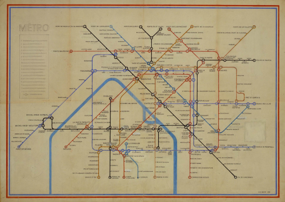
Beck's proposal for the Paris Métro, 1951 © London Transport Museum
Beck continued to submit daring new proposals until his death in 1974 — including an especially prescient prototype for the Paris Métro (above), and a design that combined London’s above ground and underground transit systems — though none were realized in his lifetime.
And even though the Underground has since expanded into the sprawling leviathan it is today, its map remains firmly tethered to the design principles Beck introduced 80 years ago.
"The concept is still clearly his," Renton says. "And I think it should be rightly credited to him."
:format(webp)/cdn.vox-cdn.com/uploads/chorus_asset/file/25047551/236883_Epic_Vs_Google_C_CVirginia.jpg)
:format(webp)/cdn.vox-cdn.com/uploads/chorus_asset/file/25083325/1._Azure_Maia_100_in_hand.jpg)
:format(webp)/cdn.vox-cdn.com/uploads/chorus_asset/file/25062779/wallpaper.jpg)
:format(webp)/cdn.vox-cdn.com/uploads/chorus_asset/file/24533944/STK437_Electric_Vehicle_charge_EV.jpg)