"Some people in our society feel regimented," the AT&T company film began. "Others feel free. Still others see society as dehumanizing."
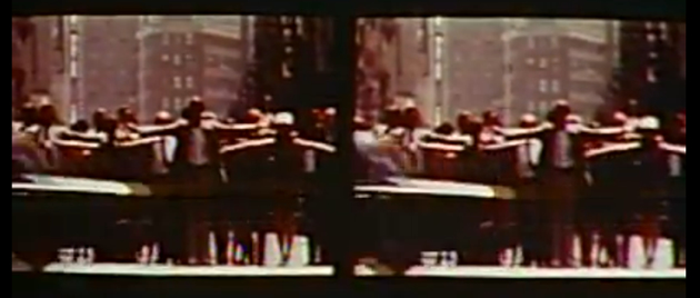
As audiences of Ma Bell executives heard those words in 1969, they watched a split screen showing the same scene twice: a crowd of pedestrians crossing a busy city street, then breaking into calisthenics as a traffic signal blinked "ONE, TWO, ONE, TWO!" at them.
One wonders what these Bell System execs thought as the film continued: "We're fighting a war. Making a peace. Integrating. Segregating. Getting richer. Getting poorer. It's quite a time to be alive."
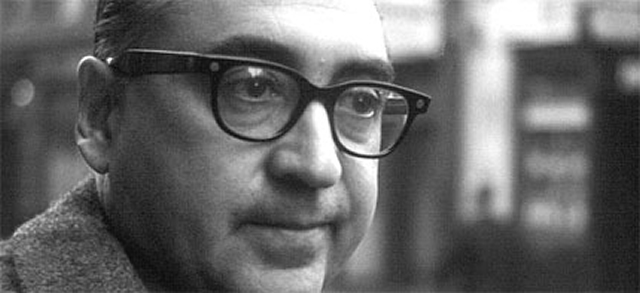
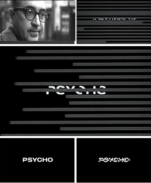
It was also quite a time for monopoly AT&T—an increasingly competitive time. The main point of the film, now released on AT&T's video archive site, was to introduce AT&T's top brass to designer Saul Bass' new Bell logo, which rolled out in 1969. By then Bass had won world renown for his daring designs of the title and credit scenes for movies like Alfred Hitchcock's Psycho, Bunny Lake is Missing, and Otto Preminger's Man With a Golden Arm.
It's no exaggeration to say that Bass saw his revised trademark as part of a rescue mission for the telecommunications giant.
"What does this all add up to, this new Bell look?" asked the film, produced by Bass' company. "Our present look: dull. Our new look: alert. Our present look: government issue. Our new look: enterprising."
But a contemporary viewer with some knowledge of AT&T's history could come away with a sense that the larger purpose of the 27 minute logo meditation was to prepare AT&T for a United States of America in which it wasn't the only telephone service. MCI was licking at the corporation's heels with its new microwave long distance plans. The FCC had just released its Carterfone decision, which forced the AT&T behemoth to allow consumers to connect any legal device to the network, even if it wasn't [gasp] one manufactured by AT&T.
And so Bass played to the wounds of his beleaguered client. The film made fun of customers "complaining about the finest products made anywhere in the world." A woman griped that her washing machine wouldn't be repaired for a week; a man lamented the quality of his car. "At ninety I get a vibration; they just don't make them like they used to."
"Many of us here today remember when it was quite different," the movie nostalgically continued, displaying scenes from the Great Depression. "The pursuit of happiness had ground to a halt. Survival was the goal. Just to have a job, but to have a job with security. That was the prize in 1933. How long a product lasted was more important than how well it looked. Wall Street had forgotten 'blue sky' and was now talking 'blue chip.' Down to earth. Safe. That was the place to be."
Back then, Bell looked "safe, durable, contemporary, part of the vacuum tube age," the film explained. But times had changed, looks had changed. "And ours? Not enough . . . In a fast-moving society, we look set in our ways."
Since 1960, 38 of the top 100 industrial companies had changed their trademark logos, the film noted; now it was AT&T's turn. In amusing telephone conversations with an imaginary AT&T executive, Bass' experiment in corporate cajolery conceded that the company had adjusted the Bell logo through the decades. But his narrator insisted that these changes had been superficial; it was time for a fundamental makeover.
And so the new image cut the phrase "Bell System" from the center of the trademark, given how difficult the words were to read. Instead the text would appear next to or at the bottom of an updated picture.
Finally, the improved logo would appear in larger designs for trucks and company apparel that included stripes. "In the contemporary world, stripes have a message," the documentary proclaimed. "They say 'competitive,' 'competent,' 'alert,' 'dedicated.' They say the things we the Bell System actually are."
AT&T went along with Bass's design revisions—up to a point. The logo redesign applied to 135,000 Bell system cars, over 20,000 buildings, 1,250,000 phone booths, and more telephone directories than there were people in the United States at the time. But the company passed on his proposed uniform makeover for phone installation and support teams.
Unfortunately for the telco, Uncle Sam did not agree with the film's assertions about competitiveness. Through the 1970s, the Justice Department relentlessly pursued an antitrust suit against the corporation, which finally surrendered in 1983—AT&T agreeing to divest itself of its regional companies and focus on long distance and data services. Even then, Bass was on hand to help, designing AT&T's post-breakup logo (or "death star," as it was subsequently dubbed).
"Gentlemen, Bell is alive and living in the mainstream of today," Bass's movie concluded, as an orchestral version of the Beatles song "Magical Mystery Tour" played in the background. The company's new look would say, "We will be the communications leader of tomorrow, just as we lead today."
It's never a good sign when you have to hire an advertising agency to convince the public that you are still alive. Still, Saul Bass deserved credit for trying.
Hat tip: The Atlantic
Listing image by photo by Harrie Verstappen
reader comments
51