When we first did a hands-on with the new TED Books app for iOS two weeks ago, I had a fair amount of nits to pick, despite liking the idea of the app overall. There were mysterious instances of pixelated, non-retina graphics scattered throughout, the sharing features left a lot to be desired, and it kept prompting you to subscribe even if you had subscribed. I also felt that the app could be improved with the ability to read comments from the main screen, and the ability to separate downloaded versus non-downloaded books.
The TED team apparently took our criticisms to heart—or at least some of them, anyway. It turns out the app's release to the App Store two weeks ago wasn't the official launch; I was told after the fact that the real launch was pending, but that final tweaks might still be coming down the line. Those tweaks have now hit the App Store in the form of an update to the TED Books app's "official" launch, so I thought I'd take another look to see whether some of those problems had been fixed.
What's been improved
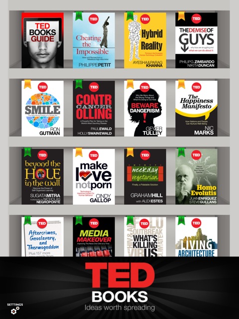
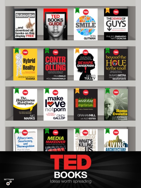
Up front, the TED team has removed the book-shaped prompt to subscribe from the top left corner of the app if you're already a subscriber. (The new screenshot is at the top of this post.) I had complained that the "Subscribe and download all books on this display FREE" book was taking up unnecessary space on the main bookshelf screen—a seemingly innocuous problem that becomes exacerbated by the inability to separate out the books you actually wanted to read from the ones you don't care for. That is now gone if you've already shelled over the $14.99 three-month subscription, though you still can't separate out your downloaded books from the rest.
Next up is the elimination of the most obvious—but not all—non-retina icons. I had noted in our original writeup that some images included within the books, and all of the options along the bottom of the page while you're reading weren't optimized for retina displays—this was perplexing since the app was just released for iPad and iPhone when both devices currently have retina displays. (The iPhone in particular has had a retina display since July of 2010, so there was really no excuse.)
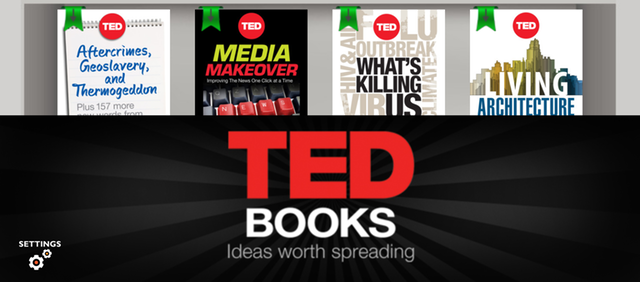
The latest update to the app makes the icons across the bottom of the reading screen sharp and modern-looking—thank goodness—and overall, the images in books look quite good. This is what the app should have looked like when it quietly made its way into the App Store earlier this month. But there are some areas where there are some obviously low-res graphics—most notably, they can be seen on the main bookshelf screen in the form of the green and yellow ribbons at the top of each book. The "TED Books: Ideas worth spreading" banner across the bottom of the bookshelf screen isn't particularly sharp either; it's not painfully pixelated, so the effect is subtle, but a close look shows that the image doesn't contain the same level of sharpness of everything else on the screen:
Again, these may seem like pretty light nitpicks—and some of them are—but they're worth pointing out because they really highlight the attention to detail (or lack thereof, in some cases) that go into these apps. TED is known in the geek crowd for being progressive, forward-thinking, and high-quality, so the fact that there's still lower-resolution imagery sprinkled throughout the app raises an eyebrow for us. Perhaps if the app itself wasn't free, the developers might have put more effort into making sure to cross all their T's and dot their I's. Either way, these are relatively easy things to fix, so I'm reasonably confident that the app may gain sharper graphics again in a future update.
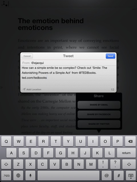
The sharing features have also been improved a bit since the app's original release. When I tried them the first time, the Facebook option didn't work at all, the Twitter field brought up nothing but a blank, iOS-standard Twitter window, and the e-mail option just included a screenshot of the front cover of the book I was sharing. The e-mail option still does the same thing with the latest update, but when I tried Facebook this time around, it actually did something (after I logged into Facebook through the app). The option brought up a window that shares a thumbnail of the book in question with a description, and the option to add my own commentary. Similarly, trying the Twitter sharing feature populated the tweet window with some descriptive text about the book and a link to the TED Books page on the Web.
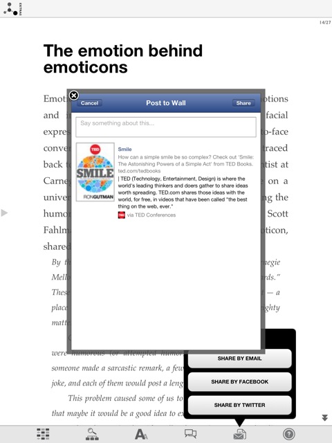
This is a million times better than nothing, but I still think the links could be improved if they linked directly to a page for the book on TED's website. And even better than that would be the ability to highlight text within one of the short books, and then share that snippet to Twitter/Facebook. (Admittedly, this idea comes mostly from the Kindle app, but it really is the best way to share content from within e-books. If you can share an actual snippet that you found interesting with your friends and family, they will probably be more interested in reading the book than if they're just looking at a general description.)
Update: It turns out you can share passages; just highlight the text you want to share and a pop-up will offer to post it to Twitter, Facebook, or e-mail. Plus 5 points for the TED Books team!
What's still the same
Some of our other nits remain in the updated version of the app. As I already mentioned, there's still just one big bookshelf on the main screen that contains both the downloaded and un-downloaded books that are available on the server. (If you're not a subscriber, each book can be purchased for $2.99, but they are all jumbled together whether you want to keep looking at them or not.)
Comments are still only viewable from within the book themselves after you've downloaded them. This is minor, but I still think it would be valuable to potential buyers to be able to see reader comments before committing to each book. As of right now, the comments feature is somewhat hidden and some users may not ever discover it, so moving them to the bookshelf view might help discoverability, too.
Finally, although TED Books is able to sync your subscription status between devices (if you have it installed on, say, your iPhone and your iPad), it still can't sync your read status or current page on the books you've downloaded. This, I think, is the main thing that will keep people from really committing to TED Books, since they can't catch up where they left off on different devices. Then again, these books are short—the equivalent of Kindle Singles—so maybe that doesn't matter as much since they should take less time to read. Still, it's a feature that would really benefit the app, so I'm still holding out hope.
Conclusion
The official release version of the TED Books app does contain a number of improvements over its initial release a couple of weeks ago, and those improvements do help to add much of the polish that I felt was missing. But there are still a few dangling threads that, if taken care of, could make the app look (and act) even more pulled-together. Fixing those and adding some missing features would help the app live up to TED's reputation as an organization, so I look forward to seeing what kind of features might come in further updates in the future.
reader comments
2