:format(webp)/cdn.vox-cdn.com/uploads/chorus_asset/file/12798305/happymac_large_verge_medium_landscape.1419971966.png)
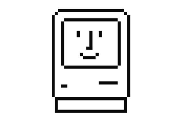
Designer Susan Kare has been called to the stand today to testify in the Apple v. Samsung trial. Kare was a member of the Macintosh team in the project's early days, and was responsible for such well-known classics as the "happy Mac" startup graphic, the Chicago and Geneva fonts, and the lasso and paint bucket icons. The icon layout of the iPhone is in play in both Apple's design patent and trade dress infringement claims, and we expect Kare will have quite a bit to say on the subject.
Kare has just taken the stand in Judge Koh's courtroom, so let's get going (all times in Pacific Time):
9:35 AM: Dr. Kare has introduced herself to the courtroom, and gone over her history: she was employed by Apple from 1982 to 1986 as part of the Macintosh Software Group. Her official title? "Macintosh Artist."
9:38 AM: She's been asked to explain icons, which she describes as "bitmap graphics made up of small pixels."
9:40 AM: She's designed "thousands of icons for hundreds of clients." Dr. Kare is showing icons she created for Microsoft, early Macintosh icons including the "dogcow," and images she created for Facebook Gifts.
9:42 AM: Apple's attorney has asked Dr. Kare what she was asked to evaluate. Her focus was on the icon design patents, and and "Whether I thought there were viable alternatives for iPhone screen graphics, and whether Samsung copied Apple's screen graphics."
"What a person thinks of a symbol is at the heart of what I do"
9:46 AM: Does she perform research on her own designs? "What a person thinks of a symbol is at the heart of what I do... I have some practical experience of being out in the world and seeing what I've done," but some of her employers do formal research and share it with her.
9:50 AM: We're now looking at the icon layout for the original iPhone.
9:52 AM: Kare is comparing Apples '305 icon layout patent with all models of the iPhone. Even though things vary from phone to phone, due to the consistency of elements like squared icons with rounded corners "I could see all of that collection of features, that overall visual impression, in all the phones."
9:56 AM: Did Kare see a similarity between the '305 patent and the Samsung phones she looked at? "Yes."
9:56 AM: A direct comparison between the '305 patent and the Samsung Fascinate. "My conclusion is that this application screen shown on the right is substantially similar to the D'305 patent." Samsung objects because this conclusion was not in Kare's initial report. It's also import to remember the is a comparison of the Fascinate's applications screen — not its homescreen.
10:05 AM: Now we're on to the Captivate, the Continuum, the Droid Charge, the Epic 4G, the Galaxy S 4G, the Gem, and the Indulge. She found "the overall visual impression" of all the phones to be the same as the patent. The look of the icons, along with both the dock and the use of a sans-serif font, led to her opinions about the similarity.
10:06 AM: Infuse 4G, Mesmerize, and the Galaxy S Showcase — all with the same opinion from Kare. Again, we're looking at the Android applications screen rather than the homescreen.
"The overall visual impression was substantially the same."
10:09 AM: Minor differences in the Showcase, including the placement of the location dots at the top versus the bottom, are pointed out. Kare states that "I was looking at overall visual impression. I didn't miss that, I looked at everything. But I concluded that the overall visual impression was substantially the same."
10:10 AM: ...and one more: the Vibrant.
10:11 AM: We're now moving on to trade dress claims. Kare: "I was asked to look at the screen, the homescreen of the iPhone. And compare that to a series of application screens on Samsung phones, and give my opinion on whether a consumer would find them confusingly similar."
10:13 AM: We're looking at a slide of the iPhone 3G on the left; on the right are application screens from 11 different Samsung phones. What did Kare find? "I concluded that this set of screens, 11, that the overall visual impression from all of these screens... one by one, compared with the iPhone 3G, were confusingly similar."
10:14 AM: Samsung objects again, saying that the notion of confusion was never addressed by Apple with regard to its trade dress claims. Judge Koh overrules the objection.
"In addition to my formal analysis I had the experience of being confused."
10:18 AM: Kare is asked about the basis for thinking users could be confused. "It is my opinion that the overall collection of graphic features that makes the overall visual impression could be confusing for a consumer. Partly I base that on my visual analysis. Partly, I remember when I was at the law firm about being a expert witness in this case there was a big conference table with many phones on it... I could see the screen and went to pick up the iPhone to make a point about the UI graphics, and I was holding a Samsung phone. I usually think of myself as someone who is pretty granular about looking at graphics, and I mistook one for the other. So, I guess in addition to my formal analysis I had the experience of being confused."
10:25 AM: "I found that the collection of features, graphical features that we just discussed, was present across all of these phones, to create in this set of screens the similar overall look that is confusingly similar to the phones on the left." Kare did find that the "condensation" background in later versions of iOS lessened the confusion, but it was still present.
10:30 AM: Another slide from Apple, showing the registered iPhone trade dress — again, an image of the original iPhone's home screen — against 11 Samsung phones. Surprise: Kare found them to be similar. "I concluded that the visual impression overall of these 11 screens was confusingly similar to just the screen portion... the homescreen, in the illustration on the left."
10:30 AM: The court is taking a brief break, but we'll be back shortly!
"You're only limited by your imagination."
10:50 AM: And we're back! We're now diving into the topic of alternate designs — design solutions that serve the same purpose without copying the exactly implementation. Kare says the goal is to "come up with a variety of ideas to solve a particular screen design problem. It's not an exact science. It's what makes it fun. Think of a problem, and try to solve it... in a better way.... You're only limited by your imagination."
10:51 AM: Kare found some examples of alternative design. One of them? The BlackBerry Torch. Apple's attorney asks Kare that device is actually sold. "Well I saw one, so I assume so."
10:56 AM: Comparing the Torch to the iPhone. "I looked for screens that had about the same number of things on them that performed approximately the same functionality... to show you could do a design that does not look confusingly similar," Kare says. "In this screen, you can see that just be having the batch of icons not on a consistent shape, it looks different..."
"All of these similarities... was beyond coincidental."
10:58 AM: "It seemed to me that all of these similarities... from phone to phone... was beyond coincidental... It seemed likely to me that Samsung used iPhone screen graphics as a guide."
11:01 AM: Apple is trying to introduce slides of evidence but Samsung objects. Apple refers to it as "slow-down tactics" given the strict time limitations both sides are dealing with.
11:02 AM: Several of the slides were entered into evidence last week with Justin Denison. Koh rules that Apple will need to lay foundation for the additional slides.
11:04 AM: The slides in question are the internal Samsung evaluation documents we saw last week, with Samsung pointing to similarity between the iPhone's icons and those of the Galaxy S. Kare describes them for the jury but can't read any text after Samsung objects.
11:07 AM: And Apple's done for the moment. Charles Verhoeven will be handling the cross-examination for Samsung.
11:08 AM: Several individuals just came into the courtroom and sat on the Samsung side. Looks like somebody's expecting a show.
11:11 AM: First thing out of the gate, Verhoeven asks about using the application screen for comparison rather than the homescreen on the Samsung devices. Kare didn't evaluate the homescreen in her evaluation, but she acknowledges that users will see the homescreen when they first turn on a device — and will have to take an action to get to the applications screen.
11:14 AM: Verhoeven plans to show the jury one of the phones to demonstrate how you get to the applications screen. Apple wants to see the phone before he does. There's some confusion about the stickers that are present on the phones, and whether they've been removed or not.
11:15 AM: Apparently Samsung removed the labels from the joint exhibits last night — with Apple's approval — because the labels had been covering up branding on the back. One of Samsung's attorneys is pointing to "the gummy stuff" on the back of the phone as proof. Yes, we're serious.
Samsung goes after Apple's confusion claims
11:20 AM: Verhoeven is walking the jury through the startup sequence of the Droid Charge — a long look at the Samsung logo while the device starts up, followed by the robot "Droid" startup sound. He's angling to hit Apple's confusion claims: "Would you agree that by the time the consumer takes all those steps to get to the applications screen they'd know it's a Samsung phone?" he asks.
11:24 AM: Kare declines to answer, saying smartphone user behavior isn't her background. "I can't agree because I haven't — I don't know about consumer behavior, starting.. .about the question you're asking me. It's outside my focus." He challenges her again, asking if it's outside her field of expertise. "Yes," Kare says, "as a graphic UI designer."
11:25 AM: We're looking at a comparison of the D'305 patent with the Fascinate. Verhoeven wants to give Kare a laser pointer to help point to an element she's discussing. She wisecracks: "I'm not a laser-pointer expert either, so..."
11:29 AM: They're focusing on the iPhone SMS icon and the Fascinate's Messages icon. Despite there being similarities, like using a speech bubble as a metaphor and utilizing the same color, Kare admits they're not substantially similar. Verhoeven continues the same line of questioning with regard to the calendar and YouTube icons on both devices.
11:33 AM: Verhoeven has some success yesterday taking the examination of the similarities to extremely granular levels — he's taking the same approach here, pointing out that there is no Maps or Stocks icon on the Fascinate image we're looking at. Short, simple responses from Kare, mostly agreeing with Verhoeven.
11:37 AM: Verhoeven is now taking on the iPhone's phone icon, which is replicated fairly literally in the Fascinate's screen. About the phone shape, Kare says that "I know that it was design in 1938... I think of it as retro." Verhoeven tries to get her to agree with him that it is a "Ma Bell phone," but she doesn't comply.
"Apple doesn't own the color green, does it?"
11:42 AM: Samsung's attorney is now hammering on the green color of the phone icon. "Green means go, doesn't it?" he asks. "Apple doesn't own the color green, does it?" Kare says "I've seen all kinds of icons for all kinds of phones," including different colors. Verhoeven is now systematically going through the clock and gallery icons.
The larger question he's inferring is clear: these designs are obvious, aren't they? Let's see if he asks it directly.
11:48 AM: Samsung's attorney slips an iPhone underneath the overhead projector in order to provide a live demonstration of the startup process. Verhoeven can't turn the iPhone on at first, and several members of Samsung's legal team stand up to help.
11:50 AM: Kare is asked if the iPhone's physical home button is part of the trade dress claims. "My task in this case was just about the display screen, and not about the physical phone."
11:54 AM: Leaving no difference unaccounted for, Verhoeven is now asking Kare about the alphabetical order of the applications screen. "Being arranged in alphabetical order is kinda useful, isn't it?" She says sometimes, but ideally that "screen elements, tends to depend on how many you're talking about, and how they're displayed. So I wouldn't categorically say alphabetically is categorically better than non-alphebetical."
"Sometimes a picture is universal."
11:59 AM: Verhoeven is circling the same argument about the designs being obvious, asking Kare if pictures are better than text for communication. Kare says in some cases not, when technology has evolved and "we see vestiges of things that look odd because the industrial designs change," like a printer. However, "as opposed to text, sometimes a picture is universal."
12:02 PM: The court just broke for lunch. We'll be back in one hour!
1:13 PM: And we're back!
1:15 PM: Verhoeven continues on his tack of pushing the notion that Apple's design choices were functional necessities, asking if the practical considerations of touchscreen devices determine placement. "It's fair to say," Kare says, "if it's a touchscreen and you're using your finger and not a stylus there's some consideration" as to spacing and placement of icons on the screen.
1:18 PM: Samsung's attorney asks whether Kare took into account functionality when evaluating the phones for trade dress or design patent infringement. "Because I was asked about the overal visual impression, to the extent that the overall visual impression includes, you know, about 20 things, I assumed from that the you need to have an affordance to make 20 things happen. But I didn't really consider the mechanics. It was much more focused on how things look."
1:20 PM: Now it's time for the attack on Kare's deposition testimony. Verhoeven starts by asking Kare if she thinks triangle-shaped icons would work just as well as rectangular-shaped icons. She says they could, though she hasn't seen it in action before. Her deposition is shown to the jury, however, in which she states that they would not.
1:22 PM: Kare says that she's reviewed her deposition testimony in preparation, and she would answer that particular question differently if asked again.
1:23 PM: Verhoeven is trying to pull some serious Jedi mind tricks here. Kare mentioned previously that the colorful array of icons in iOS was a distinguishing element. Verhoeven puts up the image of the BlackBerry Torch again, pointing out two or three colors in the icon array, asking if she's trying to tell the jury that there's no colors in the Torch display. For the record, the Torch gives the strong impression of a dark, monochromatic look.
![]()
1:25 PM: How much is Kare being paid for her services in this trial? $550 an hour. How much has she collected to date? Around $80,000.
1:26 PM: Verhoeven is done. Now it's back Apple for another round.
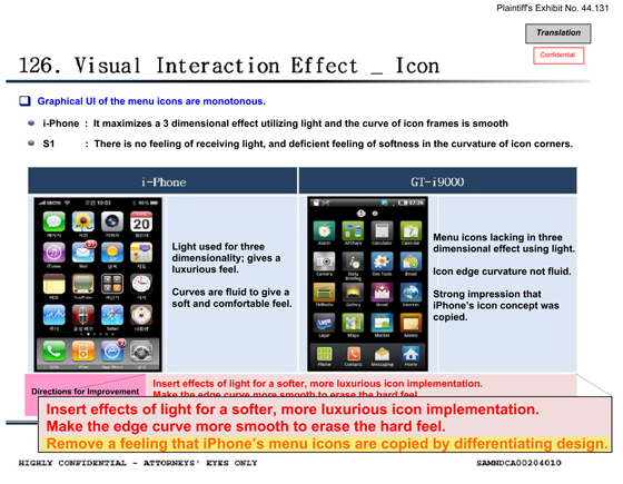
1:32 PM: Samsung's internal UI-comparison documents are back, putting the Samsung Galaxy S up against the 3GS. Apple's attorney blows up the clock icon for further inspection, but Samsung objects, saying it wasn't allowed to break out icons like that itself.
1:38 PM: Apple is comparing the internal icon review document for the GT-i9000 with the shipping icon layout on the Fascinate. A green alarm clock became a clock face which Kare says "looks a lot" like Apple's clock icon. The phone icon went from an numeric keypad to a green, old-fashioned handset — again, much more similar to the iPhone's icon.
1:43 PM: Verhoeven is back, pointing out that the text in the internal comparison document — which states that "Confusion can result from indistinguishable icons like Message and e-mail" — is about user confusion when looking at the GT-i9000's own icon set. He calls this a "functionality" issue, inferring that any changes made must have been to that end.
1:45 PM: Verhoeven finishes and Apple hits right back. What did Samsung change the Message icon to in order to avoid confusion? "A speech bubble," Kare says, in the color green. Just like Apple's SMS icon.
1:47 PM: Verhoeven makes the best of the situation by pointing out that Kare had previously said the SMS icon and the Fascinate icon "were not substantially similar." She agrees, but also points out that she noted several similarities.
1:48 PM: And that's all for Kare. Thanks for reading!
1/17