The developers behind the GNOME project have announced GNOME 3.4, a new version of the desktop environment. The update brings several significant new features and a number of design and usability improvements.
GNOME is an open source software stack that provides a desktop shell, applications, and development frameworks that are commonly used on the Linux platform. It is the default desktop environment in Fedora and several other Linux distributions. It's released every six months on a time-based development cycle.
When GNOME 3.0 arrived last year, it brought significant changes to the look and feel of the desktop. The traditional panel system was replaced with GNOME Shell, which offered a simpler and more streamlined approach to launching applications, managing tasks, and interacting with virtual desktops.
Although the new shell dramatically changed the feel of the desktop, GNOME application design didn't change very much in the original 3.0 release. But that's changing in 3.4, which introduces a new application style that promises to make the desktop's application stack more consistent with the visual language of GNOME Shell.
Application redesign
The result is a more distinctive desktop with a more visually coherent appearance, but there are still some rough edges and pieces that don't fit well. The transformation of the application stack will be gradual, following the incremental model that is typical of GNOME's development culture. That poses some challenges because it will mean less consistency between applications over the next few cycles until the effort is complete.
GNOME designer Allan Day wrote a blog post in February describing the new application style. Windows are maximized by default, emphasizing full-screen layouts. Application functionality is separated into multiple views that the user navigates between. Toolbars are pared down considerably and are intended to be used mainly for navigation and the traditional menubar is being phased out.
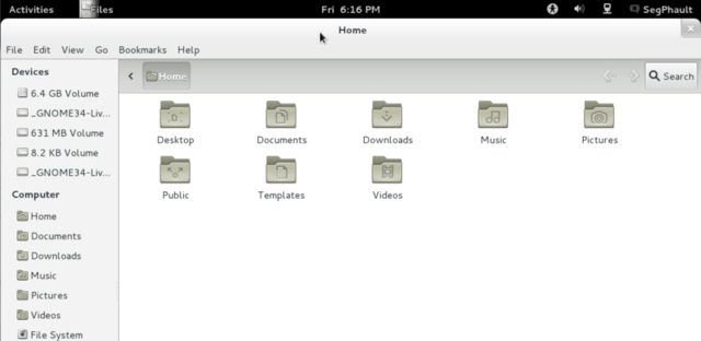
Several of the applications in GNOME 3.4 conform with that new style, but there are still many applications that haven't been overhauled yet. The applications that are designed in the new style are automatically displayed in a maximized state when they launch. They can still easily be snapped back into a normal floating state by dragging down from the top bar.
The new-style applications hide their titlebar when they are maximized. The actual name of the active application is visible in the top desktop panel. It's very similar to the behavior of maximized windows in Ubuntu's Unity desktop shell, where the titlebar converges with the top panel.
One problem with the way this feature has been implemented in GNOME 3.4, however, is that applications that haven't been updated with the new style still show their titlebar when maximized. The inconsistency is jarring, but will theoretically be less of an issue in future releases as more applications are updated to the new style.
Another major change is the move away from traditional menubars. In new-style programs, application-wide functionality is exposed through a special menu that appears when the user clicks the application's name in the top panel. Functionality that is specific to a given window is supposed to be exposed through the window's navigation toolbar.
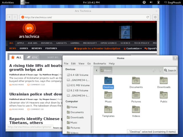
Aside from the poor initial discoverability of the panel menu, this model works reasonably well for simple applications. It significantly reduces feature density in the user interface and makes application windows feel much less cluttered. Unfortunately, it doesn't scale well in complex applications. The best example of where this approach can pose difficulties is in GNOME's default Web browser.
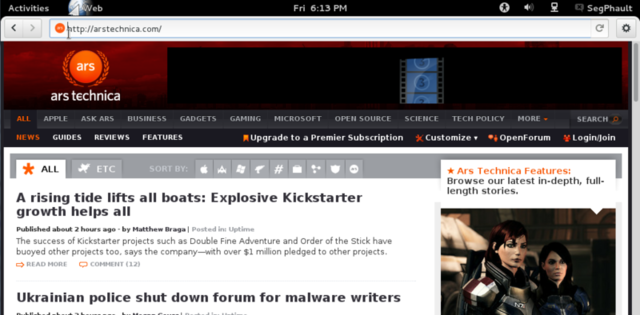
The Epiphany Web browser, which is now simply called Web, got a bit of a redesign in GNOME 3.4. It has a more streamlined interface and conforms with the new application style. The top panel menu allows you to perform application-wide tasks like creating a new window or opening the preferences. The window-specific features, like creating a new tab or saving the current page, are located in a single flat menu that is accessed by clicking the gear icon in the window.

Having the application's functionality split across two completely separate menus does not constitute a usability improvement. The new model works fine in simple applications where you can just assume that any feature not exposed directly in the navigation bar is in the top panel menu, but the model falls apart when the user has to start guessing about which menu will contain the feature they are searching for.
Solid new features
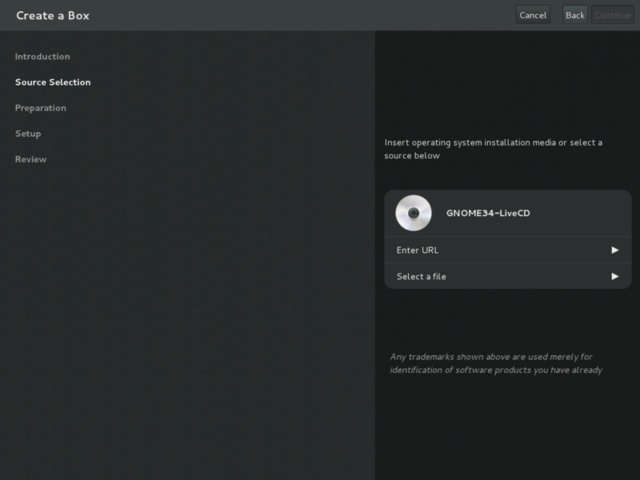
Aside from the redesign, there are a number of other compelling features in GNOME 3.4. One that's particularly exciting is Boxes, a unified interface for managing virtual machines and connecting to remote systems. The introduction of Boxes will help make KVM, the Linux platform's powerful built-in virtualization system, more easily accessible to regular end users.
Another new application is Documents, which provides a flat view of all the user's documents. It's backed by Tracker, a filesystem indexing tool. Unfortunately, I didn't have much luck with it during my test of GNOME 3.4. It didn't show any of my articles, which are markdown-formatted plain text.
Under the hood, GNOME's underlying Gtk+ development toolkit also got several improvements. Touch event handling has been added, along with support for kinetic scrolling in the standard GtkScrolledWindow widget. The toolkit's support for CSS theming has also improved, which has in turn made it possible to deliver more native-looking theming on Windows, albeit just in time for Windows 8 to move the goalposts with Metro.
The GNOME design seems to be increasingly tailored for simplicity and to accommodate touchscreen interaction on small displays. The look is appealing and the general approach is consistent with broader industry trends, but it raises some tough questions.
GNOME once appeared to have a promising future on mobile devices, but those days are long past. Efforts to turn GNOME into a mainstream mobile platform have repeatedly failed. Today, use of the conventional upstream GNOME environment is largely confined to a niche audience of technical users.
As the GNOME designers continue to chase the prospect of a broader audience, some of the changes that they are making arguably go against the grain of how the desktop environment is used right now by its current audience. Maximizing windows by default and making the main application menu accessible through the top panel are changes that would work well on tablets, but are only going to be frustrating on a desktop computer with a pair of big widescreen monitors.
For more details about GNOME 3.4, you can refer to the official release announcement. GNOME 3.4 will appear in the next major version of many Linux distributions, including Fedora 17, which is scheduled for release in May. If you want to test it today, you can download the GNOME 3.4 live image from the GNOME website.
Listing image by Photograph by sean dreilinger
reader comments
94