Two-and-a-half years ago, we reviewed a tablet called the Maylong M-150. It was a $99 Android tablet sold exclusively at Walgreens, and there is a word for the people who spent their hard-earned money on it: "rubes."
We (without hyperbole) called the Maylong M-150 the "worst gadget ever," but the times have changed. Android has improved by leaps and bounds, hardware has become both faster and cheaper, and the Nexus 7 (still one of our all-time favorite Android tablets) starts at a mere $199. When Hisense announced its $99 Sero 7 Lite tablet alongside its Nexus 7-esque $149 Sero 7 Pro a couple of weeks back (a separate review is forthcoming), we figured it was time to revisit this price point to see what, if anything, had changed.
Can Benjamin Franklin buy you a good tablet in 2013? We'll run the Sero 7 Lite through the wringer to find out.
Body and build quality: Feels a little better than $99
| Specs at a glance: Hisense Sero 7 Lite | |
|---|---|
| Screen | 1024×600 7" (170 ppi) 5-point capacitive touchscreen |
| OS | Android 4.1.1 "Jelly Bean" |
| CPU | 1.6GHz dual-core Rockchip RK3066 |
| RAM | 1GB |
| GPU | Quad-core ARM Mali 400 |
| Storage | 4GB NAND flash (expandable via microSD) |
| Networking | 802.11b/g/n |
| Ports | Micro USB, mini HDMI, headphones, microSD |
| Size | 7.87" x 4.80" x 0.41" (200 x 122 x 10.5 mm) |
| Weight | 0.73 lbs (330g) |
| Battery | 3400 mAh |
| Starting price | $99 |
| Other perks | Power adapter |
| Warranty | One year |
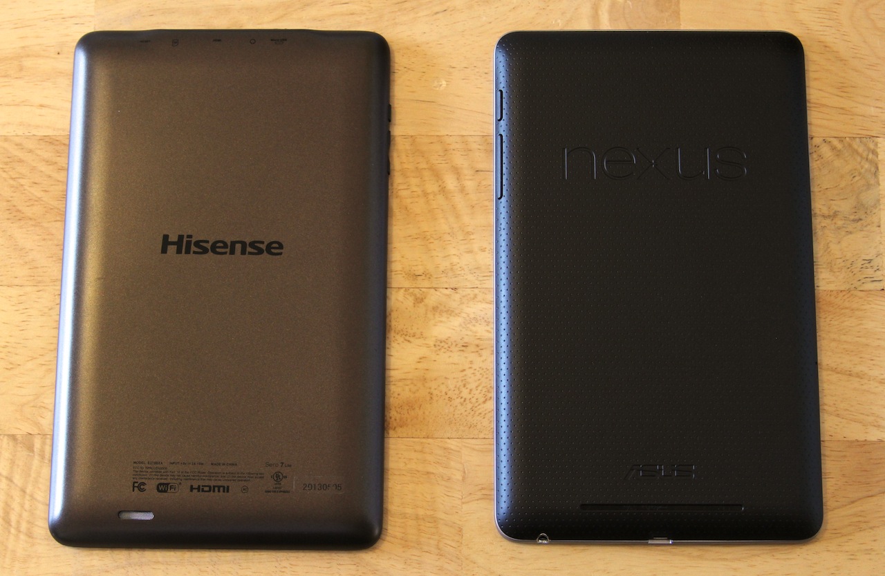
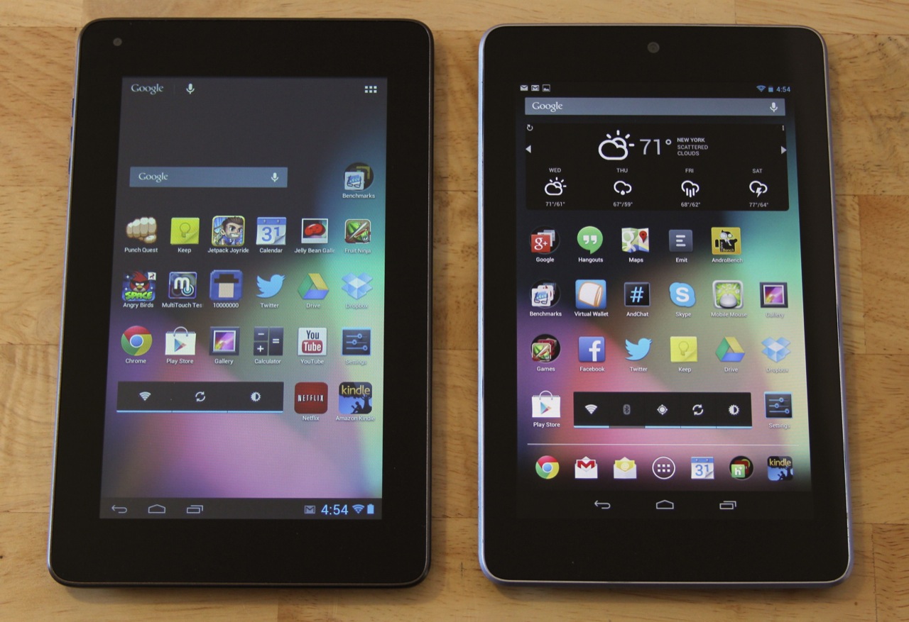
The Sero 7 Lite doesn't have the build quality of something like the Nexus 7 or Kindle Fire, but it's not as bad as I was expecting. It's got an all-plastic back and a glass front, and relatively thick black bezels surround its 7-inch touchscreen. The tablet is very slightly larger in height and width than the Nexus 7 (7.87" by 4.80" by 0.41" compared to 7.81" by 4.72" by 0.41"), but the two weigh basically the same (0.73 pounds for the Sero and 0.75 for the Nexus).
The brownish plastic back of the tablet actually doesn't feel too bad to hold—it lacks the slightly rubberized, grippy texture of something like the Nexus 7, but it's reasonably sturdy for the price. It does flex a bit if you press on it, especially toward the middle where the Hisense logo is, but the construction and the heft of the tablet are much better than I was expecting.
That said, when the tablet is in active use, the top of it can get pretty toasty—not hot enough to be in any way dangerous, but certainly warm enough to make the tablet smell faintly of burnt plastic. It doesn't inspire a ton of confidence, but since the tablet didn't burn my apartment down I'm willing to describe it as a minor annoyance rather than a deal breaker.
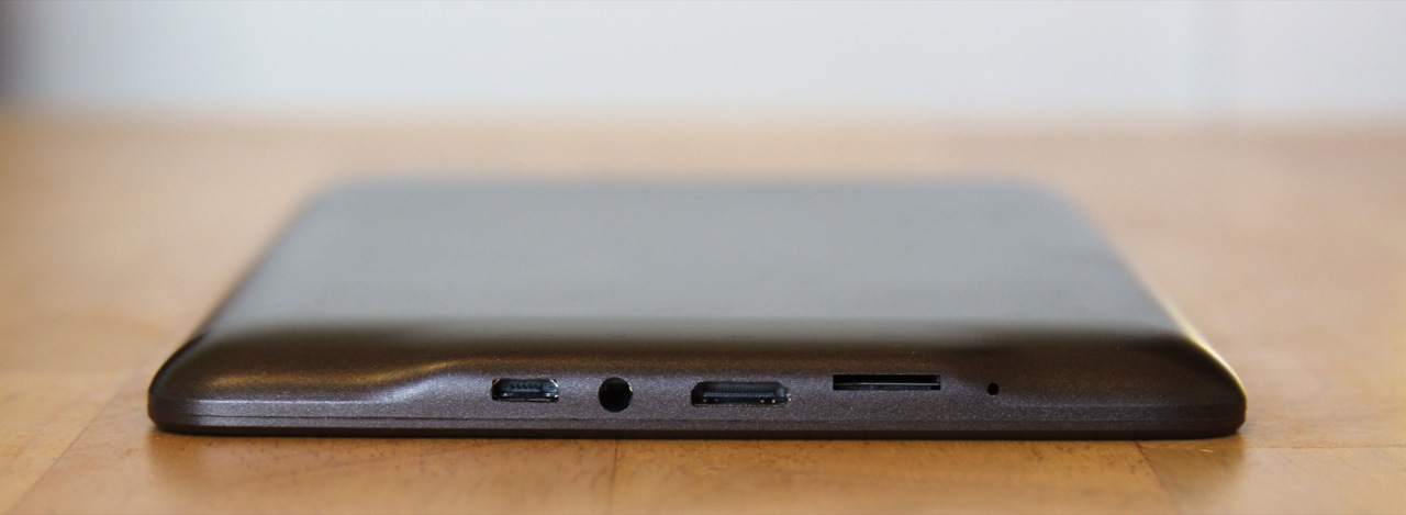

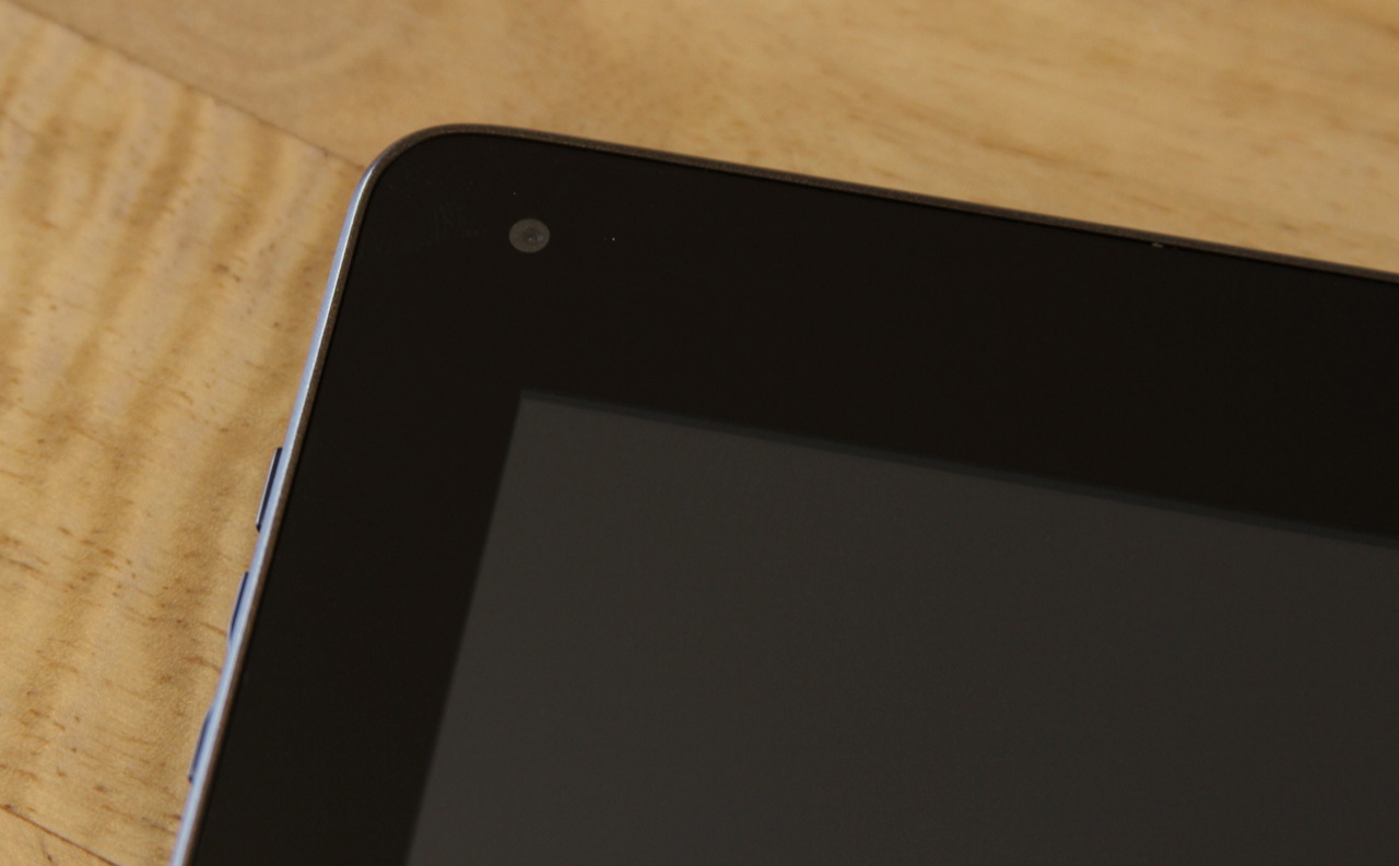
All of the Sero 7 Lite's ports are lined up across the top of the tablet, and it actually comes with a couple of things that the Nexus lacks. The first is a microSD card slot, which can expand the tablet's paltry 4GB of internal storage by up to 32GB. The second is a mini HDMI port, which supports 1080p and 720p at 50 and 60Hz (576p at 50Hz and 480p at 60Hz are also available options). You can choose the HDMI output resolution manually in the tablet's settings, along with overscan settings.
Otherwise, the tablet doesn't come with many perks, and even things we would consider "bare necessities" are pretty perfunctory. There isn't a rear-facing camera, but the 0.3MP front-facing camera should suffice for video chatting and (grainy, low-res) selfies. The single, rear-facing speaker is quiet and has absolutely no bass worthy of the name. However, the tablet's microphone worked perfectly well with Google Now and the sound quality out of the headphone jack isn't any worse than my Nexus 7.
The screen: Definitely looks like $99
The body of the tablet isn't the height of quality, but the screen is where you're really losing out. For starters, it's a 7-inch 1024×600 display with 170 pixels-per-inch, which you'll definitely notice in a world where screens with 200, 300, or even 400 PPI are becoming the norm. The bigger problem by far is image quality: the display is very cool (in the blue sense, not the Fonzie sense), colors are washed-out, the contrast ratio is low, and all of these problems are exacerbated by shallow viewing angles.
In fact, it's hard to find anything nice to say about the display, other than it's a five-point capacitive touch affair that seems reasonably responsive and accurate (the Maylong used a resistive touchscreen instead, which is much less pleasant to interact with). Everything on it looks cloudy and bluish, and the contrast ratio is so poor that it makes the pixel density look worse than it actually is. Allow me to demonstrate using a first-generation Kindle Fire, which also has a 7-inch 1024×600 display.
Those of you with long memories may recall that we rooted this Fire last year to demonstrate how Amazon's Android fork was holding its hardware back. We took it out of mothballs and re-flashed it with the RC4 build of CyanogenMod 10.1 so we could run some of the same apps on it and the Sero 7 Lite side-by-side.
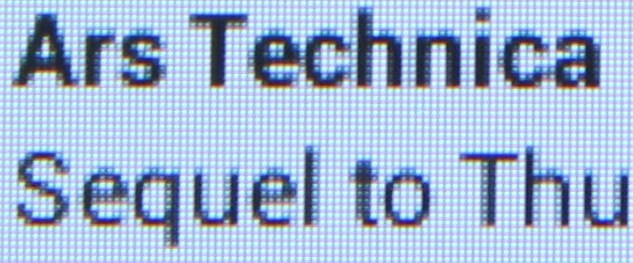
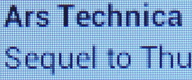
The two screens share exactly the same resolutions and pixel densities, but text looks even worse and blurrier on the Sero 7 Lite. The contrast ratio on the screen is so bad that Android's font smoothing makes those fonts look worse in many apps—the subtle grey edges added to the letters bleed too much into white and black backgrounds. In general, it's also difficult to distinguish different shades of black or grey from one another, which may cause additional problems in some applications.
Finally, the glass that covers the front of the tablet lacks any sort of oleophobic, fingerprint-resistant coating. The tablet's screen quickly becomes a smudgy mess over the course of just a couple of hours, and those smudges prove difficult to get rid of.
The screen is usable, but it irritates my eyes a little to read text on it for extended periods of time. It's a poor screen, plain and simple, and it's the biggest reason to spring for a more expensive tablet.
The software: 10-inch UI, 7-inch screen
Let's start with the good stuff: the Sero 7 Lite is running a largely bloatware-free, stock version of Android 4.1.1 with full access to the Google Play store, Google Now, and all of that version of Android's other major features. There are a few pre-installed apps, most of them borne of the tablet's Wal-Mart exclusivity: the Vudu video player app, Sam's Club and Wal-Mart apps, the AccuWeather Plus app, and a copy of the (free) Kingsoft Office suite. Otherwise, pretty much everything is stock; stock e-mail app, stock browser, stock fonts and icons.
That a $99 tablet wouldn't come with Android 4.2 when most major companies' products still don't is not surprising, but that it doesn't at least come with Android 4.1.2 and its various bug fixes is a little odd. Even more odd is that the tablet doesn't use the purpose-built 7-inch tablet interface introduced by Jelly Bean and the Nexus 7, but the "old-style" 10-inch tablet layout introduced by the Motorola Xoom and Android 3.0. The Xoom retained this interface in its Android 4.1 update, but the Nexus 10 and Android 4.2 swapped it out for something more consistent with the phone and 7-inch interfaces.

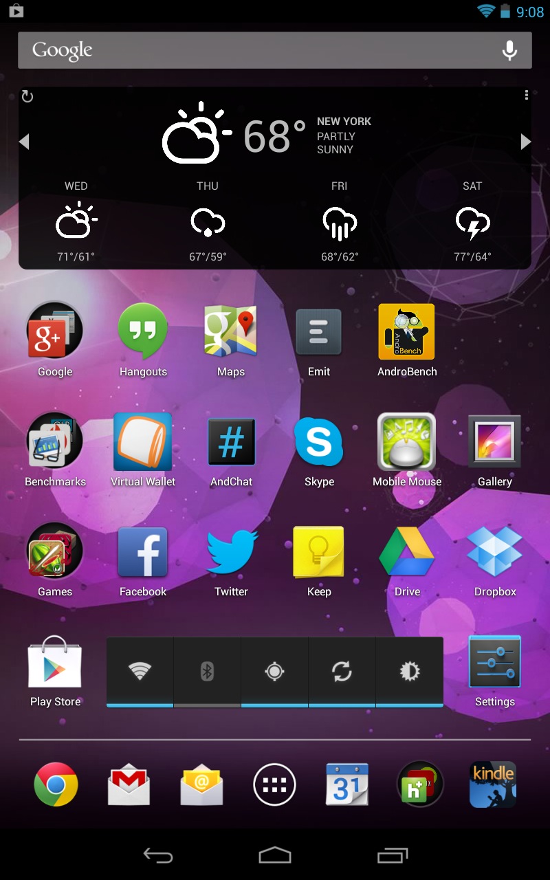
As someone used to the Nexus 7, I realize that my preference for the "phone-like" 7-inch tablet layout may be a matter of personal taste. That said, it's difficult to overlook how much screen real estate the layout wastes, especially while in portrait mode—enough for at least two full rows of application icons. The old 10-inch interface was always a bit more functional in landscape mode, but in portrait mode (the way I hold 7- and 8-inch tablets most of the time) you're not making the best use of the screen.
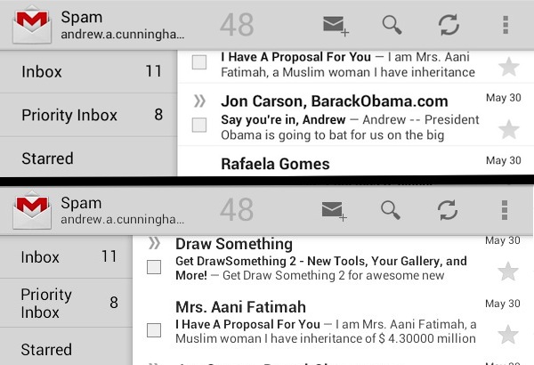
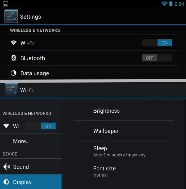
This observation extends to some of the applications, which try to use a layout and spacing intended for a 10-inch tablet on a 7-inch screen and just end up looking cramped. We pulled up the Settings and Gmail apps to demonstrate what we mean.
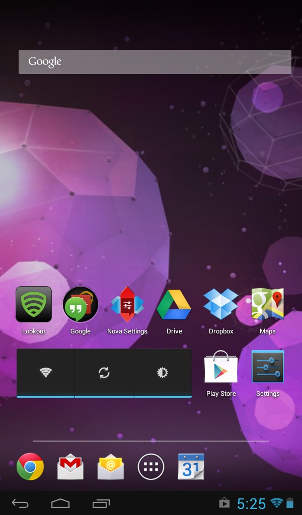
Alternate launchers can help with some of these problems—with a little tweaking, I was able to get Nova Launcher to give me a Nexus 7-esque look-and-feel on the tablet's home screen, though the notifications and system settings were still on the bottom of the screen instead of the top and applications that try to use their "10-inch" layouts were still problematic. Again, it really comes down to what you're used to—if, as I do, you prefer the 7-inch Android layout as introduced in Jelly Bean on the Nexus 7, the "old-style" layout on the Sero 7 Lite is going to drive you a little crazy.
reader comments
47